A dashboard is a presentation of geographic information and data that allows you to monitor events, make decisions, inform others, and see trends. Dashboards are designed to display multiple visualizations that work together on a single screen. They offer a comprehensive view of data and provide insights for at-a-glance decision making. Similar to web maps and web layers, dashboards are part of the ArcGIS geoinformation model. They are items within your organization that can be identified by their icon  when browsing and searching for content.
Dashboards are composed of configurable elements, such as maps, lists, charts, gauges, indicators, and tables. Most elements are data driven and represent the information you want to present to the intended audience.
A dashboard can be created with both a desktop and mobile view, both of which can have different elements and configurations. When the dashboard is opened for viewing, users see the optimal view for their device. By default, a desktop view of the dashboard is created. When users need to view the dashboard on phones, a complementary mobile view can be created.
Desktop views
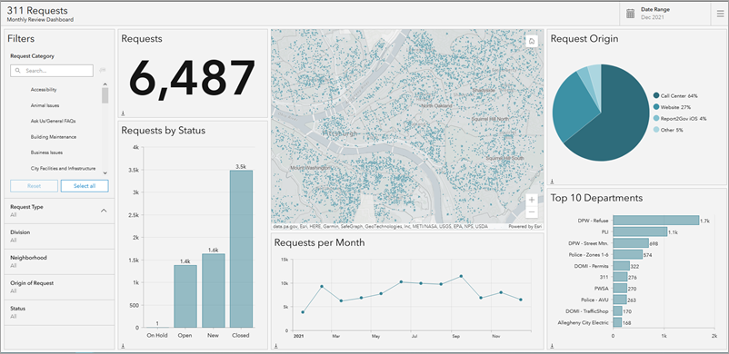
Desktop views allow you to see—on one screen—the data you need to be informed or make decisions. The views can be designed for use in both unattended and attended scenarios. Unattended dashboards are often displayed on a large screen in environments such as operations centers and provide a more passive user experience. In contrast, attended dashboards are generally viewed on desktop monitors and tend to offer a more interactive user experience. An example is shown below.

Mobile views
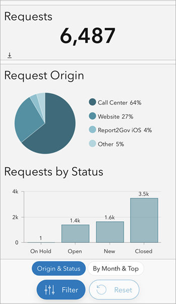
Mobile views can include specific visualizations relevant for on-the-go viewing, and positioned for convenient navigation on phones in portrait mode. They have an optimized user experience for selectors, maps, and content navigation. A mobile view can have the same elements as a desktop view, or new elements specifically configured for mobile viewing. An example is shown below.

Types of dashboards
There are many reasons to create a dashboard, and many types of dashboards you can create. Dashboards allow you to do the following:
- See all the data you need to be informed or make decisions.
- Monitor the most important information about your day-to-day operations.
- Ensure all your colleagues are focused on the same goal through viewing and using the same information.
- Monitor in real time the health of a business, product, organizational team, or campaign.
- Inform communities about ongoing events, emergencies, and initiatives.
- Create a personalized desktop and mobile view of a larger set of data to show all the metrics that matter to you.
The type of dashboard you create should be based on who you're sharing it with and the information you want to convey. Some dashboards are operational in nature and are designed to tell you what is happening in the moment while matching the quickly changing nature of incidents and events. Some dashboards are strategic and are ideal for those who are monitoring their organization's performance indicators and metrics. Other dashboards are analytical and are used to identify data trends, patterns, and other characteristics. Lastly, some dashboards are simply informative and are used to tell a story with the data.
The following are characteristics of an effective dashboard:
- Draws your attention to where it's needed
- Shows what's most important on a screen full of data
- Allows its audience to understand what's happening and respond quickly
- Expresses performance measures clearly, accurately, directly, and without distraction
Once the dashboard is assembled, you can share it with its intended audience. You can share dashboards publicly with everyone or only with people in your organization. You can promote your dashboard by providing a link to it or embedding it in another website or app.
To get started creating a dashboard, see Create a dashboard.